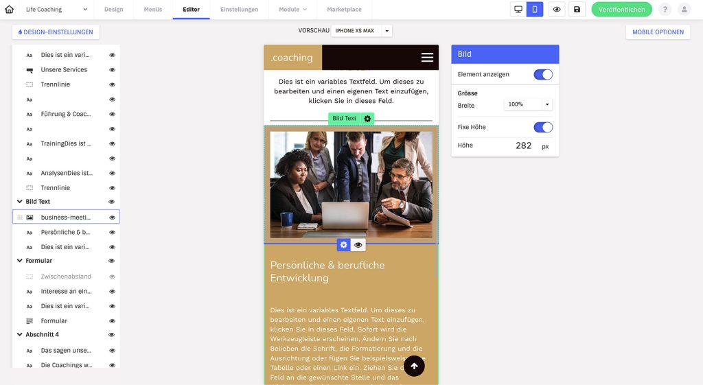
Would you like your website to also appear optimally on mobile devices? Then use the mobile editor to create a fully functional and professional looking mobile view. You have the option of optimizing the layout of your pages for mobile devices, making various layout adjustments and hiding desktop content.
All settings and changes in the mobile view have no effect on the desktop version.
Most important points
- A mobile version of your website is automatically created based on the desktop version and does not have to be created from scratch.
- The content is (continuously) taken over from the desktop version and cannot be changed (e.g. image motifs cannot be changed or texts altered). The menu is also generated automatically.
- Multi-column layouts are always converted to a single-column layout (can also be changed via the settings of an element) and all elements are listed one below the other.
- Even if the layout is generated automatically, check all pages again before you publish your website. You may want to hide individual elements (spacing) or change the order so that it looks better on mobile. Color adjustments may also be necessary.
Wie wechsle ich in die mobile Ansicht?
Switch to the mobile view in the editor menu via the mobile symbol in the top right-hand corner.
Logo
The logo is the only element that is not transferred from the desktop version and must be uploaded or designed separately on mobile.
Elemente ausblenden
- A list of the individual sections and elements used on the page is displayed on the left.
- Click on the eye symbol to show or hide individual elements or even entire sections.
Note: From a search engine perspective, hiding sections does not make sense, as relevant content may not be visible, which has a negative effect on search engine indexing. In addition, different desktop and mobile versions can lead to a poorer ranking result. Keep the desktop and mobile view as similar as possible and only change what is necessary.
Reihenfolge ändern
You can change the order of elements within a content section using drag-and-drop.
Element settings
Design-Einstellungen
The font size and color can be defined globally for all (mobile) pages via the design settings. Font, line height and all other settings are taken from the desktop version.
If you manually overwrite the font size or color on the desktop page, this will also be applied to mobile. It is therefore best to overwrite as little as possible manually, especially the font size.
See: Why is the font on Mobile so big?
Mobile Optionen
The “Mobile options” button on the right-hand side provides further display options:
- Navigation aids: Activates a “Back to top” button, which is displayed at the bottom right of the content page. Click to return to the top of the page.
Vorschau
In the mobile view, you can select various common smartphone models from a drop-down menu to check how the website looks on different devices. A preview for tablets is being worked on.
